.png)
.png)
Crunchy Apple Stacks

A Fresh Take on Nutrition, Variety, and Kid-Friendly Choices
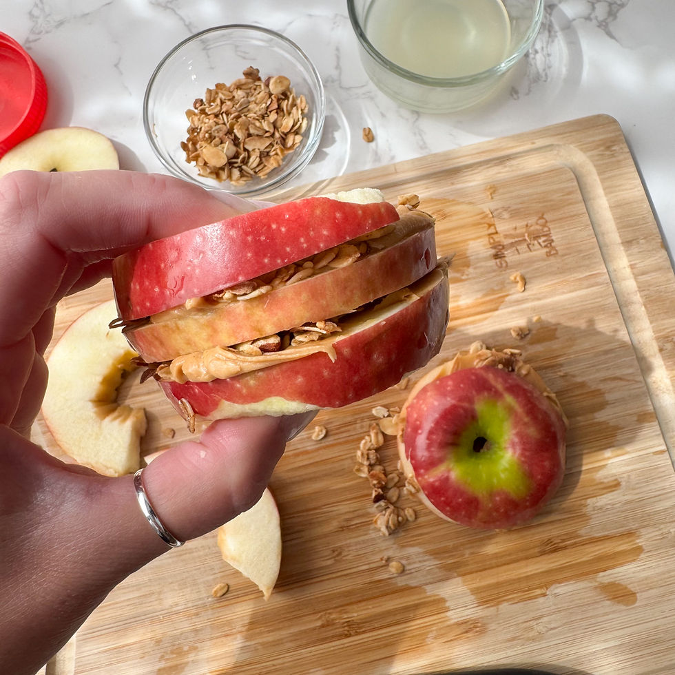
Looking for a creative, nutritious alternative to the classic sandwich? These Crunchy Apple Stacks are a fun, fresh twist and perfect for school lunches. Instead of bread, crisp apple slices form the base, creating a naturally sweet “sandwich” that’s both appealing and wholesome. Fill them with creamy nut butter and a sprinkle of crunchy granola for a balanced mix of healthy fats, fiber, and some protein to keep kids full and energized throughout the day.
Not only are these bites easy to prep, but they’re also portable, and lunchbox-friendly—a win for busy parents and hungry kids alike. You can even switch up the nut butter or granola to suit your child’s preferences or dietary needs. It’s a simple, satisfying snack that checks all the boxes: nutritious, delicious, and just the right amount of fun.
Yield: 1 serving
Total time: 10 minutes

Ingredients:
1 large apple* sliced into flat pieces or rings (*see recipe notes)
2 Tbsp lemon juice
Nut butter of your choice or sun flower seed butter
No-sugar added granola
Directions:
Dip the sliced apples into the lemon juice. This will help prevent browning.

Spread the nut butter on to one of the apple slices.

Sprinkle with granola.

Top with another apple slice.

Optional: add raisins or chocolate chips
Enjoy!
Recipe Notes:
Any apples will work, but try using opal apples, they are naturally non-browning.
Honeycrisp and Pink Lady apples are also a recommendation- they are very sweet and a bit slower to brown.


sobre a Hiperbet eu só entrei pra dar uma olhada rápida na organização do portal e, sinceramente, achei bem mais fácil de entender do que muitos guias por aí. Em vez de jogar um textão, eles vão direto ao ponto com blocos curtinhos e títulos bem óbvios, então dá pra pescar o que interessa sem ficar caçando no meio da página. Outra coisa que curti é que eles deixam bem explícito que é um guia independente e não o site oficial, então não rola aquela confusão chata de “tô no lugar certo ou não?”. No geral, a leitura flui porque tem bastante separação visual e as infos principais ficam destacadas, especialmente naquele “resumo rápido” em formato de tabela que aparece…
Nãy thấy mọi người bàn về giao diện web nên mình cũng nói ké một chút cho đúng mạch. https://789winn.games/ hôm qua mình ghé qua lúc rảnh, kiểu vào xem bố cục có dễ nhìn không chứ không đọc nội dung kỹ. Trang họ chia khu vực khá rành mạch ngay từ phần đầu, kéo xuống là biết mình đang ở đoạn nào, nhìn không phải đoán. Mình để ý mấy bảng thông tin trình bày theo cột gọn gàng nên liếc cái là nắm được số liệu, chữ cũng thoáng nên đỡ mỏi mắt (mình hay khó chịu nếu chữ dính sát). Thanh menu đặt vị trí dễ thấy, đổi mục qua lại khá nhanh, dùng kiểu lướt lướt…
This was a nice read because it stayed simple and didn’t make me feel like I had to decode anything. The points flowed in a way that made sense, and the quick examples helped it feel more like someone talking from experience instead of tossing out random tips. Halfway through I ended up clicking around newimage.io for a bit since it gives off the same “helpful but not overwhelming” vibe when you want to check something fast. I also liked how the writing didn’t drag—just enough detail to get the idea without turning into a wall of text. The page itself is easy on the eyes, with clear headings and short paragraphs that make skimming super painless.